The Industry Standard Manuscript
For writers of narrative fiction and nonfiction. Read on for guidance and templates supporting the construction of an industry standard manuscript in preparation for submission.
Please note . . .
- This page discusses the presentation of your manuscript as a document: margins, typeface, header positioning, etc. For styling of the prose itself, please reference my discussion which can be fount here: https://errantruminant.com/styles-for-writers/.
- I can also review your manuscript or assist in ensuring it meets a publisher's specific guidelines. For such services, check out my little hiring portal. Or contact me and we can chat.
As both a writer and as an editor of a literary journal (County Lines), I live and breathe manuscripts. I construct them for myself in preparation for submissions to publishers and I review hundreds upon hundreds of them every year.
Like everything, there is a method. A convention. A convention of consistency and sameness. The publishing industry has its expectations, and if you are serious about writing, you need to be serious about ensuring your manuscript is formatted professionally and as expected. Fortunately, all publishers and agents follow essentially one set of guidelines—one each for short stories, long stories, screenplays, and poetry. (Nonnarrative nonfiction is a beast unto itself. We are not going to address that here.)
What Publishers Want
Publishers want:
A clean manuscript in manuscript standard format, using the Times New Roman typeface in 12pt, and saved as a Microsoft Word .docx file. They look at a zillion manuscripts. They don't want to spend excess brain energy on documents that look different from one to the next.
Publishers don't want:
Bespoke formatting. Publishers don't want you to use your favorite typeface or spacing; they don't want to see smaller or larger fonts or indents or margins just because you like them better. Occasionally, some will accept documents formatted in the .pdf or .odt file format, but not often. Yes, .docx and the Times New Roman typeface are proprietary, but they are what the industry has standardized on. And for all of you who are fans of Courier (or the more modern, much improved, Courier Prime), the world prefers Times New Roman over Courier unless you are writing a screenplay, which is beyond the scope of this document.
Publisher requirements can be nuanced:
Specific requirements: Nearly all publishers post their formatting requirements. Especially if they have their own requirements that deviate from the norm. Verify a publisher's peculiarities and adapt your manuscript to match. Some are very tolerant and offer a lot of freedom in how you present your work. Most are rather vague, and if that is the case, it's probably best to follow the standards you find here on this page, or something very similar.
Manuscript Formatting Standards, A Summary (for narrative works)
| Manuscript Element | Formatting Standard |
|---|---|
| File Format | .docx |
| Typeface (Font) | 12pt Times New Roman—for everything. (See comment later in this article about nonfiction.) |
| Page Margins | 1" all around. |
| Line Spacing | Double-spaced—for everything, except . . . - 1st page headers (contact and word count blocks): single-spaced. - inserted poems, and other special-cased items. |
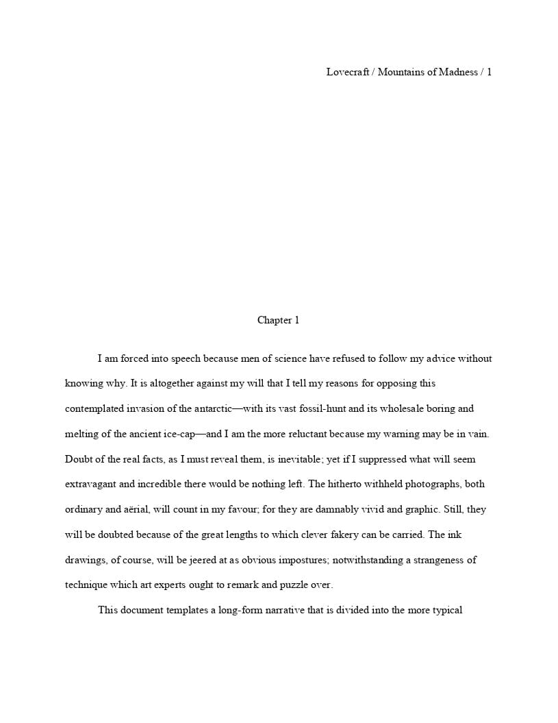
| Paragraph Text | Left justified, 0.5" first line indent. - No extra spacing between paragraphs, no extra spacing after sentences (CMOS 18th ed., 6.7), no sentence-wrapping hyphenation. - Story begins directly after a chapter title (long narratives) or directly after the page one title (short narratives). |
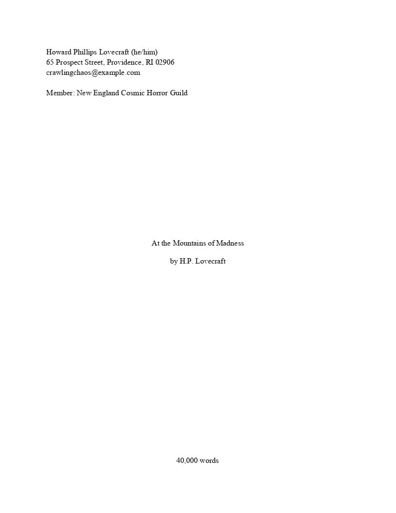
| Contact Block | page one, left justified, single-spaced, upper-left-hand corner, no indents. Legal name, address, and email. |
| Count Block | Word count, page one, single-spaced - Short narratives: right justified, upper-right-hand corner. - Long narratives: centered, bottom footer of page one. |
| Title Block | Page 1, 1/3 to 1/2 down the page, centered. Title, then subtitle, and then byline (pen name). |
| Chapter Title Block | New page, 1/3 to 1/2 down the page, centered. Title, then subtitle. |
| Page Header | Right justified, 1" from the top, upper-right-hand corner: byline-lastname / title / page-number Note: (1) The numbering starts at page #2 for short stories and page #1 for long stories. I.e., The numbering scheme follows the story text. (2) Long titles are shortened |
| Dinkus and The End Markers | Scene separation marker (#), and story end marker (The End); both are centered and double-spaced. |
Manuscript Formatting Standards, A Summary (for poetry)
| Manuscript Element | Formatting Standard |
|---|---|
| File Format | .docx |
| Typeface (Font) | 12pt Times New Roman—for everything. (See later comment in this article about nonfiction.) |
| Page Margins | 1" all around. |
| Line Spacing | Single-spaced—for everything. |
| Contact Block | - Poetry collections: page one, left justified, single-spaced, upper-left-hand corner, no indents. Legal name, address, and email. - Poems: the same, but for each poem no matter what page. |
| Count Block | - Poems: line count, right justified, upper-right-hand corner of poem. - Collections: poem count, centered, bottom footer of page one. |
| Title Block | - Collection: page one, 1/3 to 1/2 down the page, centered. Title, then subtitle, and then byline (pen name). |
| Poem Title Block | New page, 1 inch-ish from the poem's contact header, centered. Title, then subtitle, and then byline. |
| Poem Text | Left justified, 0.5-inch hanging indents for each line, no sentence-wrapping hyphenation. Poem begins directly after a poem title. |
| Page Header | No per-page page headers, but if a poem extends beyond a page, you add a next-page indicator block in the upper-left-corner of the next page. See template for examples. |
| Dinkus and The End Markers | Not used. |
The Templates
Provided below are links to a industry standard templates to help you get started.
Remember, these represent the final format for your document when you want to share it with another party. Personally, I do 99% of my writing and revision, scene by scene, in what is really just a glorified text editor. When I feel the work is nearing a finished state, I copy the appropriate template to a new file (a recent example: warner-gone-to-the-dogs.docx) and then cut-and-past the words from each text file into the .docx file. (Ensure you paste the text as unformatted text. Word processers, in an attempt to "assist" may leave you with substantial busy work cleaning up their guesswork. YMMV.)
| Template | Description |
|---|---|
manuscript-prose-short.docx |
Short narratives. For example, flash fiction and short stories. Check out the blind version: manuscript-prose-short-blind.docx |
manuscript-prose-long.docx |
Long narratives. For example, novelettes, novellas, and novels. Check out the annotated version: manuscript-prose-long-annotated.docxCheck out the blind version: manuscript-prose-long-blind.docx |
manuscript-poem.docx |
A single poem. |
manuscript-poems.docx |
A set of poems. |
manuscript-poetry-collection.docx |
A poetry collection. |
submission-cover-letter.docx |
A standard cover letter. Note: how you submit cover letters is variable and often managed by a raw web form. |
writers-cv.docx |
An example of a rather pedantic and semi-formal writer’s CV (Curriculum Vitae). |
Embedded Formatting Styles w/in the Templates
Learn to use the tools of your trade! I can't emphasize this enough. Take your work seriously and others will as well. That means, you need to stop using your word processor like it's a text editor. It's a word processor, and with a word processor, we manage all of the formatting of a highly structured document—like a manuscript—through the use of specifically configured styles.
Each template above leverages customized styles to manage each significant and differentiated block of text: contact block, title block, word count, the prose, the poetry, etc. These custom styles are pretty self explanatory, but here is a brief description of each . . .
| Style | Description |
|---|---|
mContactBlock |
The manuscript’s contact block in the upper-left-hand corner: legal name, mailing address, other contact information, relevant memberships, and associations. |
mCount_short |
Short story word count. Or poem line count. |
mCount_long |
Long story word count. Or poetry collection poem count. |
mTitleBlock |
Title, subtitle, and marketing name (pen name). |
mTitleBlock_chapter |
Title, subtitle, and marketing name (pen name) for a chapter. |
mTitleBlock_poem |
Title, subtitle, and marketing name (pen name). Poem titles are closer to the top of the page. |
mPageHeader |
Page header: marketing (pen) lastname / short title / page number. Note, only appears on pages after the initial page of the document. |
mDinkusTheEnd |
For dinkuses, scene separators (the # sign), and for the end of document The End (some folks use END) |
mProse |
For prose text. |
mPoetry |
For poem text. |
Note that over time, I may rename some of these styles and maybe even add one or two more.
The Word Processors
Microsoft Word is what your publisher will be using to examine your manuscript. Ideally, you would construct your manuscript using Microsoft word. I personally don't! I use OnlyOffice or LibreOffice. I don't have access to Microsoft Word at home. So far, knock on wood, I have not had an issue. That being said, I recommend that no matter what you use, you test drive it on Microsoft Word, the desktop version, and make sure that document looks exactly as you expect.
OnlyOffice, LibreOffice, and WPS Office do a good job. But, always check your work! (Also, OnlyOffice Docspace is an impressive cloud service.) One way to check your work, if you don't have a friend who can help, is to take your .docx file to a library and use their computers and their copy of Microsoft Word to ensure the formatting came out correctly.
Important for LibreOffice users: You must save the document as 'Word 2007' and not 'Word 2010-365'. LibreOffice's support for the newer Word format is simply not good enough for our purposes.
What NOT to use (as of February 21, 2026) . . .
- Do not use Microsoft Word online.
MS Word 365 online is awful. It is extremely buggy. It will mess up your document as it forgets your style settings, for example. I am not providing a link to the service simply because I don't want you to accidentally use it. - Do not use Google Docs.
Google Docs is a tremendous word processor and it gets most things right. But its feature set is a bit limiting, limiting enough that I don't recommend it at this time.
⸺That should be enough for most people to get started. Good luck with your submissions. 
Other Topics
CMoS and The Shunn Standard
Grammar and Usage and the Chicago Manual of Style
The mechanical format of your document is important, but so are the words on the page. For narrative prose published in the United States, styling is expected to steer toward The Chicago Manual of Style. Consistency often takes precedence, but you are less likely to ruffle feathers if you try to follow the CMoS to the best of your ability. More on that topic can be found here: https://errantruminant.com/styles-for-writers/.
The Shunn Standard
Author William Shunn provides an excellent resource that demonstrates standard manuscript formatting for prose (short and long) and poetry. His guidelines, though occasionally dated here and there, are what are used to develop what you see on this page. The templates here are more accurate to what the industry expects than the templates Shunn provides, currently.
What Standards Are Not Addressed Here?
-
Screenplays have strict guidelines and leverage the Courier-family of typefaces (Courier Prime and the older Courier New or the even older Courier) typefaces exclusively. Check out articles by Final Draft (which uses their own Courier Final Draft typeface which is what Courier Prime was developed from), San José State, Careers in Film, StudioBinder. Note that the Courier New typeface is guaranteed to be installed on all versions of Microsoft Word and, if given no other context, is the safer choice.
-
Nonnarrative works (how-to manuals, explainers, and similar—example, this document) generally follow something that looks like the guidelines for narrative fiction, but paragraphs are not indented and are instead space-separated, and sans-serif fonts are more acceptable. (For example, Arial or Aptos). Refer to your publisher's formatting standards. Note that the Aptos typeface is only supported by the latest versions of Microsoft Word (as of 2026). The Arial typeface is a supported by all versions of Word and, if given no other context, is the safer choice.
What about genre and draft versions and such?
The genre of your story or novel, or the variety of your poem, goes in your cover letter. That being said, if you are not sharing a cover letter with the recipient (a critique group, for example), some folks will indicate the genre right beneath the word or line count. For the critique group example, I will often indicate the draft version with a date also placed with the word or line count. For example, rev. 20260222.
Word Counts
The format to use for your manuscript changes depending on word count. These are rough guidelines to where the boundaries are for short and long narratives. Note, the numbers are a bit mushy.
Short-Format Works
| Category | Word Count Range | Notes |
|---|---|---|
| Flash | 1,500 or 1,000 or fewer | Includes drabbles (100 words), dribbles (50 words or fewer), and micro-fiction. |
| Short Story | 1,500–7,500 | Sometimes extended to 10,000 words. |
Long-Format Works
| Category | Word Count Range | Notes |
|---|---|---|
| Novelette | 7,500–17,500 | Often the "in-between" length for specific genre markets. |
| Novella | 17,500–40,000 | Common for standalone digital releases. |
| Novel | 40,000+ | Convention varies by publisher and genre. |
Advice About Epigraphs
There is no standard for formatting epigraphs. Epigraphs are either artful or serve as a very short prologue. And so, a good rule of thumb: if your epigraph serves as a prologue, include it; if it does not, perhaps don't at this stage of the process.
Considering its nature, an epigraph will often be formatted as a very short "scene" at the beginning of a short story or chapter. If the format of the epigraph is nonnarrative (a poem, for example), do your best to ensure it looks as professional and simple as possible.
Remember, this is a manuscript formatted for submission for consideration for publication, this is not a manuscript in final published form. Often more artful flourishes are added during the publishing process, not in these pre-publishing processes.
Advice About Filenames
Make your filename for your document useful. My preference: lastname-short-title-date.docx, all lowercase. For example, the filename for a recent submission of mine was warner-gone-to-the-dogs-20260131.docx.
⸺I hope this page has been useful. Good luck! -t
Published January 31, 2026; Updated March 16, 2026